If this is your first visit, be sure to check out the FAQ by clicking the link above.
You may have to register before you can post: click the register link above to proceed.
To start viewing messages, select the forum that you want to visit from the selection below.
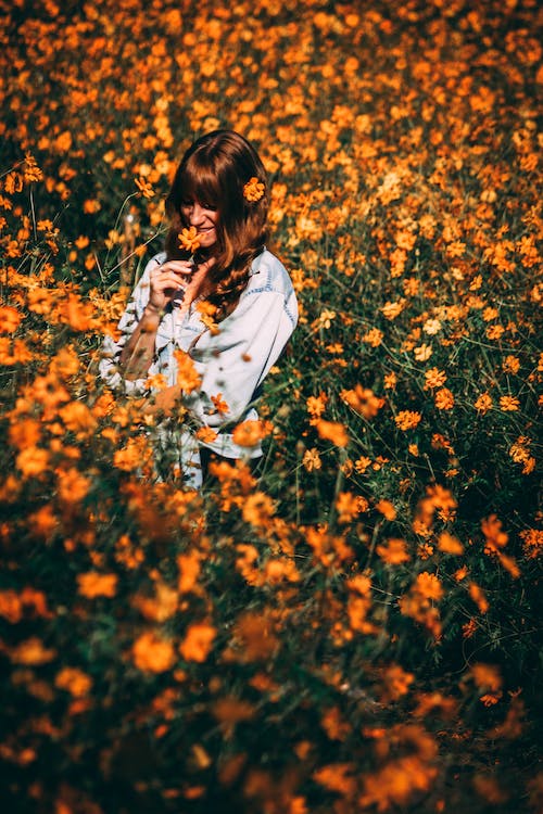
HELLO, FRIENDS AND ENEMIES. This is my third Seektober thread, and I'm going in a different direction this year. I hope it makes sense on paper/in pixels as much as it does in my head. This year, I'm going to create color palettes inspired by the prompt, along with a little watercolor 'doodle' to showcase the colors together. I will also try to post the inspiration for the palette. Cross your fingers this makes a lick of sense.
I'm using the Aparecium method with a random number generator, so we're going to get a truly mixed bag approach!
Made of Awesome | Ern-la the Best-wa | TZ's Apogee
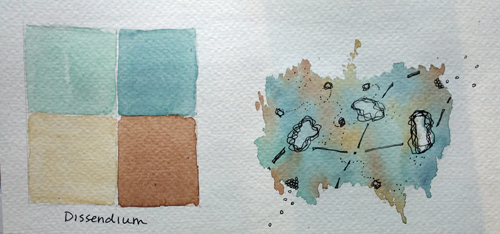
Day 1 - Dissendium
SPOILER!!: Inspiration Image
I am fully going to apologize for the terrible paper quality I'm using in this project in every single post. also for the weird shadow across my paper I didn't notice until cropping...
ANYWAY, Dissendium is that spell that opens the Hunchback Witch statue to reveal a secret passage, and I wanted to look for something that evoked that secret passage for me. If it was REALLY a secret passage it probably should have been four shades of black, but this palette makes me happy.
Toothless - Napoleon of Crime - Gryffinclaw - Owl Emissary - Pirate Auror - DoctorDonna
I can see it...both in the inspiration and the palette itself. The beige and brown being the earthen and wood passage, with the blue and green harkening to the brighter, happier colors to be found at the end in Honeydukes
Made of Awesome | Ern-la the Best-wa | TZ's Apogee
Quote:
Originally Posted by Holmesian Feline
I can see it...both in the inspiration and the palette itself. The beige and brown being the earthen and wood passage, with the blue and green harkening to the brighter, happier colors to be found at the end in Honeydukes
Yes, this is exactly it!
Day 2 - Transfiguration
SPOILER!!: Inspiration Image
The paper is ACTUALLY getting worse, and you'll have to excuse the blotchy area. I tried to add a fifth color and I didn't like how it looked at ALL. The good news is that the shade I used wasn't a staining shade, the bad news is that the paper didn't want to let it all go ANYWAY. Also this paper eats paint and I am just WOEBEGONE over it.
The colors in this palette are kind of dreamy, so definitely not the hard study parts of Transfig but all the delight of magically making things appear that weren't there before. Poof.
Okay first, I absolutely love this concept of choosing a color palette for each prompt then creating a mini painting to go along with it. I really love both palettes you created so far. Your transfiguration colors are similar to my branding colors for my business lol, so they're my favorite. But the dissendium palette works so well together too.
I get the paper struggle, though you are handling it quite nicely. Paper quality can make a big difference. I had that issue last year with the paper I was using with my colored pencils. They wouldn't blend as nicely and I just decided to stop torturing myself with that paper.
__________________
started like a knight in a fairytale_______________________________________________
ended like a moth in flames______________________ ______________________don't you worry I'll be fine _________________________________________________you were good for the plot line
lemme echo mj here real quick because I also loooove your take on completing these prompts, and you know i'm a big fan of exactly the kinds of lil doodle paintings you are doing with the colour palettes you choose. it's all very whimsical in here and I am particularly enamoured with the palette and painting for dissendium and the way the colours are interacting with each other but I definitely get the dreamy magical vibes in transfiguration too
I can't wait to see what else you come up with ;;
__________________
Days of Potter 2023:___________________________ Which Bertie Botts Flavour Are You? You are Chocolate!
~ Mrs. Steve Harrington ~ It be like that sometimes.
Okay, so I am LOVING that you're letting us peek into the palettes and inspirations you choose! Double loving your creativity in the way you create your masterpieces
Made of Awesome | Ern-la the Best-wa | TZ's Apogee
Quote:
Originally Posted by Chelliephone
The dissendium color palette makes me so happy. They all compliment each other so well and it's so calming to look at.
Likewise on transfiguration! It's amazing how you were able to capture the vibe of your inspiration photo without it being a replica. I love it!
I like how it turned out too. Both of them. I wasn't totally sure about including the inspiration photo, but I like that it lets people know what I was going for. There will definitely be some where people are like "but why did you choose THAT?" and we'll just have to agree to disagree.
Quote:
Originally Posted by emjay
Okay first, I absolutely love this concept of choosing a color palette for each prompt then creating a mini painting to go along with it. I really love both palettes you created so far. Your transfiguration colors are similar to my branding colors for my business lol, so they're my favorite. But the dissendium palette works so well together too.
I get the paper struggle, though you are handling it quite nicely. Paper quality can make a big difference. I had that issue last year with the paper I was using with my colored pencils. They wouldn't blend as nicely and I just decided to stop torturing myself with that paper.
I do remember the struggle last year! I'm not sure that I can talk myself into giving up on this paper, since I paid money for it and EVERYTHING, but it's going to be pretty limited to working with color like this and nothing where I care at all about how well the paper holds up to water and doesn't drink up color immediately. Slurpy slurp paper monster.
I like that I found colors that remind you of your business branding, though! Dreamy and magical, that's my MJ friend.
Quote:
Originally Posted by Felixir
hi hi it is your fondest enemy speaking
lemme echo mj here real quick because I also loooove your take on completing these prompts, and you know i'm a big fan of exactly the kinds of lil doodle paintings you are doing with the colour palettes you choose. it's all very whimsical in here and I am particularly enamoured with the palette and painting for dissendium and the way the colours are interacting with each other but I definitely get the dreamy magical vibes in transfiguration too
I can't wait to see what else you come up with ;;
Ah, my enemy. You will see many a doodle in here, because that's where I live right now. Doodleburg. I'll have to make sure I impress you with my mad color matching skills... or something like that.
Quote:
Originally Posted by FearlessLeader19
Okay, so I am LOVING that you're letting us peek into the palettes and inspirations you choose! Double loving your creativity in the way you create your masterpieces
Peek away! I'm having a very nice time, so thanks for visiting <3.
What a perfect color palette for this prompt! Just looking at your doodle brings me joy! The colors are blend so beautifully together and I love the added ink details!
__________________
_________ _________________________________________ღღღღღღღღღღ
Let them point and laugh at who we are, it's you and me here dancing from the start
ThunderPUFF | Whoodley | MRD&LKD | Graphics Queen | Tristalen | Mrs. A | Hunny Bun
:O
I wish I had your talent I love your concept! So cool! Just beautiful. I can't wait to see more!
__________________
⫷⫷____________________________________________ I know that you're afraid to...
...let all the dark escape you._____________________________________________⫸⫸
Wizarding World RPG Admin Minister for Magic Alley Proprietor
Leprechaun
Join Date: Aug 2010
Location: The Paths
Posts: 40,315
Hogwarts RPG Name: Briallen Ashburry-Hawthorne
Gryffindor
Second Year
Hogwarts RPG Name: Nyle Harden
Hufflepuff
Third Year
Hogwarts RPG Name: Iris Harden
Ravenclaw
Third Year
Hogwarts RPG Name: Calliope Barrington
Slytherin
Second Year
Hogwarts RPG Name: Diamond Marchbanks
Gryffindor
Seventh Year
Ministry Department Head:
Charles Hollingberry
Minister's Office
Ministry Department Head:
Airey Flamsteed
Mysteries
Diagon Alley Proprietor:
Zachaël Lufkin
Owl Post
x12 x12
astronomizzle ♧ gryffinDORK | & the rest is drag ♣ #badluckDerf
Ugh. UUUUUUUUUUUUUUUGH. I'm obsessed, Ern. Absolutely obsessed. I love that you're exploring the palate concept so thoroughly and WOW do you have an eye for color combinations. Also your ink touches are just stunning. With 'cheerful', it looks as though it all is just bursting out of the paper and 'Dissendium' has this kind of...dissipating quality to the shape that is really The misty and smoky vibe for 'Transfiguration' is really lovely and definitely dreamy.
__________________
When you're stuck in a moment and your spark has been stolen .................................................. ........... this is our time to own it, so own it..................................... baby we were born withfire and gold in our eyes
Made of Awesome | Ern-la the Best-wa | TZ's Apogee
Quote:
Originally Posted by Chelliephone
What a perfect color palette for this prompt! Just looking at your doodle brings me joy! The colors are blend so beautifully together and I love the added ink details!
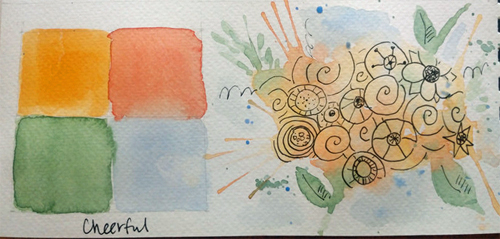
The yellow and orange are sort of DRAMA in this palette, but maybe that's the cheerful bit? Either way, it makes me happy too!
Quote:
Originally Posted by Suziella
:O
I wish I had your talent I love your concept! So cool! Just beautiful. I can't wait to see more!
<3<3<3 Come back any time, love. Thanks for the kind words!
Quote:
Originally Posted by sweetpinkpixie
Ugh. UUUUUUUUUUUUUUUGH. I'm obsessed, Ern. Absolutely obsessed. I love that you're exploring the palate concept so thoroughly and WOW do you have an eye for color combinations. Also your ink touches are just stunning. With 'cheerful', it looks as though it all is just bursting out of the paper and 'Dissendium' has this kind of...dissipating quality to the shape that is really The misty and smoky vibe for 'Transfiguration' is really lovely and definitely dreamy.
I'm hoping no one gets too stuck on the doodles, since the paper isn't as cooperative as I'd like, but they do a nice job of showcasing how the colors work together. I'm really relying on using inspiration to come up with the palettes for now, because I always tend towards safety. Color families, colors close on the wheel, that sort of thing. <3
Made of Awesome | Ern-la the Best-wa | TZ's Apogee
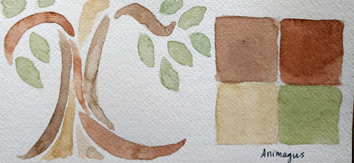
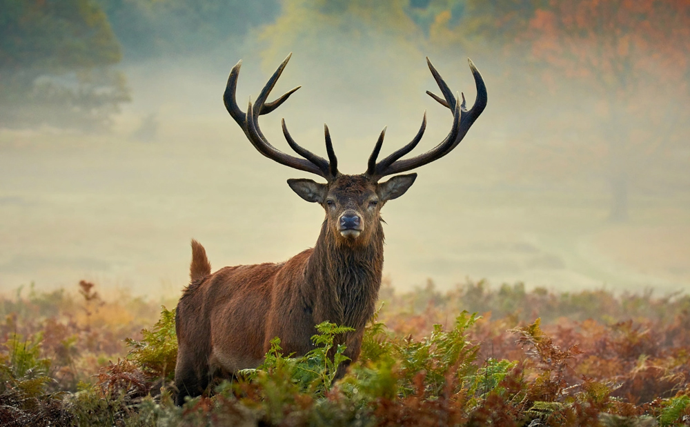
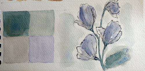
Day 5 - Animagus
SPOILER!!: Inspiration Image
I keep intending to leave a little note at the end and then getting excited and posting too fast. Oop. All I really want to say on this one is that the palette is really neutral, but I don't think that can be helped when you're looking at outdoorsy creature photos. And the doodle on this one really showcases how thirsty this paper is, because you can see the spots it soaked it up with the color. But I like how it turned out... I've done some other trees and designs with this style and they have a pretty stained glass look.
doesn't proofread tweets | #wrongaboutcereal | #siriusly? | emo to the extremo
Am I a friend or an enemy?
Color Palettes is SUCH an innovative idea. I should expect nothing less at this point. You have such big brain energy Ern. What is it like. What is it LIKE. Dissendium turned out so cool. I’m so, so pleased that you’re sharing your inspiration as well. It’s like we get to follow your mind journey and I am here for it.
?your depiction of Transfiguration is so dreamy and magical. I want to step inside the painting ern. Let me step inside. Cheerful is SOOOOOO warm and cheerful, indeed. The doodle/painting is so inviting. I want to step into this one too. LET ME STEP INTO THE CHEERFUL BOUQUET. Ohoho. This one for Mischief is so fun. I cannot even begin to wrap my mind around how you get all the colors to blend so beautifully together like this. You are so powerful.
Your animagus tree is so regal. These color palettes are turning out so nicely ern. UGH. I’m so amped to see more.
__________________
Days of Potter 2023:___________________________ Which Bertie Botts Flavour Are You? You are Lemon!
~ Mrs. Steve Harrington ~ It be like that sometimes.
That 'Cheerful' prompt tho! UGH!!! It's absolutely made me happy just looking at it! The inspiration image is such a good choice which translated perfectly into your creation :3
PS: This doesn't mean I did not immensely enjoy the 'Mischief' and 'Animagus' prompts
Made of Awesome | Ern-la the Best-wa | TZ's Apogee
Quote:
Originally Posted by ArianaBlack
Am I a friend or an enemy?
Color Palettes is SUCH an innovative idea. I should expect nothing less at this point. You have such big brain energy Ern. What is it like. What is it LIKE. Dissendium turned out so cool. I’m so, so pleased that you’re sharing your inspiration as well. It’s like we get to follow your mind journey and I am here for it.
?your depiction of Transfiguration is so dreamy and magical. I want to step inside the painting ern. Let me step inside. Cheerful is SOOOOOO warm and cheerful, indeed. The doodle/painting is so inviting. I want to step into this one too. LET ME STEP INTO THE CHEERFUL BOUQUET. Ohoho. This one for Mischief is so fun. I cannot even begin to wrap my mind around how you get all the colors to blend so beautifully together like this. You are so powerful.
Your animagus tree is so regal. These color palettes are turning out so nicely ern. UGH. I’m so amped to see more.
Hello, FRENEMY. Nope, friendo. Bestest friendo. I'm glad you like this concept because it felt a bit FANCY in my head and is not at all the same level of work everyone else is putting out. But it's what I have creativity and energy for right now, so I think it's for the best.
And I'm glad you're enjoying the palettes turned out so far. Please stop stepping into doodles, though, because they are a very real tripping hazard. At least wear boots and mittens. As for how the blending happens, that's really water. All water. I use a little spray bottle to make a happy puddle for the blobby looking ones.
Quote:
Originally Posted by FearlessLeader19
That 'Cheerful' prompt tho! UGH!!! It's absolutely made me happy just looking at it! The inspiration image is such a good choice which translated perfectly into your creation :3
PS: This doesn't mean I did not immensely enjoy the 'Mischief' and 'Animagus' prompts
It's okay if you just stop in to point out the ones that make you happy! I like how cheerful turned out TOO, and the flower doodles are always fun to execute.
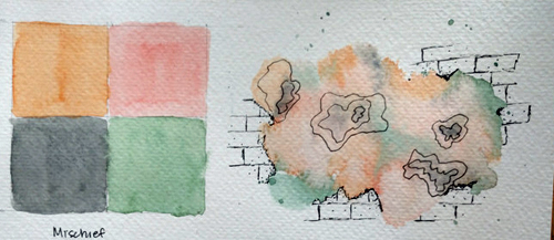
Oooh you've been busy since I last commented. I continue to love these ink doodles over the watercolor and especially the color palettes. Cheerful has the most cheerful colors, exactly what you want to see in a bouquet of flowers. There is something I like so much about pink and blue-gray together, and I really like how you used them in your mischief prompt. Morgan says it looks like bombarda cast at the wall, a spell that he enjoys lol. Love the fall colors in animagus and watering can feels so serene.
__________________
started like a knight in a fairytale_______________________________________________
ended like a moth in flames______________________ ______________________don't you worry I'll be fine _________________________________________________you were good for the plot line
oh boy that cheerful palette is very cheerful (quelle surprise) and the actual painting to go with it is so lively and rAH, it's perfect. also mischief gives me fred and george/WWW vibes for some reason, which is extremely apt.
also also I know your inspiration image for animagus is the stag but then the painting made my brain go straight to the whomping willow too. on topic.
also also also watering can has one of my favourite colour palettes so far, it's waking up a ravenclaw in my brain. it's so clean and elegant oooo ahhhh. i would drink that flower.
__________________
Days of Potter 2023:___________________________ Which Bertie Botts Flavour Are You? You are Chocolate!
Made of Awesome | Ern-la the Best-wa | TZ's Apogee
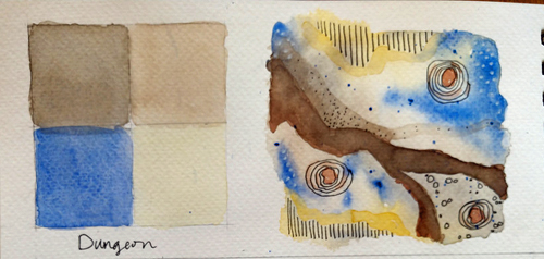
SPOILER!!: Dungeon
Quote:
Originally Posted by emjay
Oooh you've been busy since I last commented. I continue to love these ink doodles over the watercolor and especially the color palettes. Cheerful has the most cheerful colors, exactly what you want to see in a bouquet of flowers. There is something I like so much about pink and blue-gray together, and I really like how you used them in your mischief prompt. Morgan says it looks like bombarda cast at the wall, a spell that he enjoys lol. Love the fall colors in animagus and watering can feels so serene.
HELLO WELCOME BACK. I'm glad you like the doodles! They're fun, and I don't get to play with them as much when I'm doing landscapes and things. I'm trying not to get caught in a trap of doing the same type of thing every day.
And I totally see bombarda! I was going for a graffiti feel, since 'mischief' keeps bringing that to mind. <3<3
Quote:
Originally Posted by Felixir
oh boy that cheerful palette is very cheerful (quelle surprise) and the actual painting to go with it is so lively and rAH, it's perfect. also mischief gives me fred and george/WWW vibes for some reason, which is extremely apt.
also also I know your inspiration image for animagus is the stag but then the painting made my brain go straight to the whomping willow too. on topic.
also also also watering can has one of my favourite colour palettes so far, it's waking up a ravenclaw in my brain. it's so clean and elegant oooo ahhhh. i would drink that flower.
Hallo, fren. I think MJ's bombarda and your WWW vibes amount to the same thing I was feeling with the pink and orange and graphite coloring. Very playful but EDGYSOEDGY.
And I'm really like the watering can colors TOO, yes. The purple was a surprise, of sorts, but I like that drama that sort of warms the whole thing up.
Quote:
Originally Posted by FearlessLeader19
Okay so you know I adore all your work but the Water Can prompt is my absolute fave so far!!!! It's the colours for me; they give off a 'serene' vibe
I LIKE THAT ONE TOO. I think those greens give off a very serene feeling, yes. They say that about sagey greens, right? Calming and all.
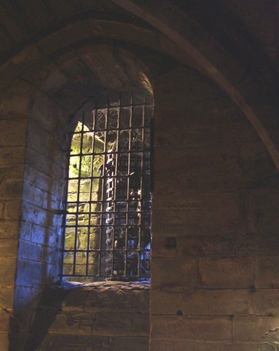
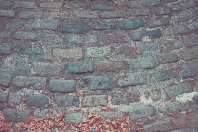
Day 7 - Dungeon
SPOILER!!: Inspiration Image
You thought you'd get a bunch of GRAY, didn't you? I mean, that's what most of the pictures I found looked like, but then I found this with that hint of saving light and reflection of water and it was much more interesting. And the grays ended up being browns and... well. It is what it is.
Made of Awesome | Ern-la the Best-wa | TZ's Apogee
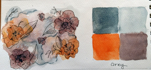
Day 8 - Grey
SPOILER!!: Inspiration Image
I'm not entirely convinced by this palette, except that I love trying to add plum to things just to see what happens. This is what happens. I swear that plum is purply, even if it looks a bit brown in this light.
Wizarding World RPG Admin Minister for Magic Alley Proprietor
Leprechaun
Join Date: Aug 2010
Location: The Paths
Posts: 40,315
Hogwarts RPG Name: Briallen Ashburry-Hawthorne
Gryffindor
Second Year
Hogwarts RPG Name: Nyle Harden
Hufflepuff
Third Year
Hogwarts RPG Name: Iris Harden
Ravenclaw
Third Year
Hogwarts RPG Name: Calliope Barrington
Slytherin
Second Year
Hogwarts RPG Name: Diamond Marchbanks
Gryffindor
Seventh Year
Ministry Department Head:
Charles Hollingberry
Minister's Office
Ministry Department Head:
Airey Flamsteed
Mysteries
Diagon Alley Proprietor:
Zachaël Lufkin
Owl Post
x12 x12
astronomizzle ♧ gryffinDORK | & the rest is drag ♣ #badluckDerf
I continue to absolutely adore these and every single four color palate is just so perfect I really cannot imagine you substituting any of them out for anything better. They all compliment each other so much and your ink details with the doodles are just so...sdjflsdfjlsd I adore these, kay? For 'grey', I especially love how the edges of the watercolor become the edges and lines for the flora and it is may be one of my favorites despite your reservations. Dungeon is such an interesting take too and I love the composition of the doodle so so much. 'Watering can' also is so soft and lovely and I love how you drew (har har) parallels between different types of flowers and it is just so Before I even read your blurb on 'animagus' I was getting stained glass window vibes and I just love it too. Your brush strokes on this one are so elegant!
__________________
When you're stuck in a moment and your spark has been stolen .................................................. ........... this is our time to own it, so own it..................................... baby we were born withfire and gold in our eyes
Raspberry Jam | #ChocolateFrogFamous | Ultimate Fangirl
Oh, I LOVE this concept so much. The colours and blends you have used on each piece are perfect and so pleasing on the eye, I am looking forward to coming back here! Especially love the dungeon and mischief prompts.
__________________
who could love me, I am out of my mind___________________________ _________________throwing a line out to sea to see if I can catch a dream
You're right, I would think of gray when thinking about a dungeon, but when I saw your inspiration photo I could totally see those colors as the hopeful light at the end of a gray tunnel. It works so well. And I would totally wear those colors in Grey. I tend to like more muted colors with just a pop of a bright color. Lovely.
__________________
started like a knight in a fairytale_______________________________________________
ended like a moth in flames______________________ ______________________don't you worry I'll be fine _________________________________________________you were good for the plot line


 x7
x7  x8
x8


 I love your concept! So cool! Just beautiful. I can't wait to see more!


.gif "heart eyes") The misty and smoky vibe for 'Transfiguration' is really lovely and definitely dreamy.
The misty and smoky vibe for 'Transfiguration' is really lovely and definitely dreamy.

.jpg)

 UGH!!! It's absolutely made me happy just looking at it! The inspiration image is such a good choice which translated perfectly into your creation :3

 Before I even read your blurb on 'animagus' I was getting stained glass window vibes and I just love it too. Your brush strokes on this one are so elegant!


