STEP ONE: open your image editor of choice and create a new blank canvas that has a height of 350 and width of 300 (again, this will work with any size but if you want to follow me to a T then this is what I was working with

). Make sure your canvas is not set to grayscale - especially when you are importing or copy pasting over a black and white image from the internet...these programs have the tendency to create new documents that are also grayscale and then you won't get any color.
Speaking from experience and doing this myself just yesterday making Kaiser's
 STEP TWO:
 find and place your image on your new canvas. You can do a more close up and bust look or full body. Just play around with placement and see what you like best. For this particular style, however, you will want something that falls in the middle of your canvas nicely to maintain a balanced kind of look - the model does not have to be looking head on.
STEP THREE: Convert your image to black and white. If you are already working with a black and white image you can skip this step. There are multiple ways for you to achieve this conversion. What I do (Adobe Photoshop Elements 9), is look at the top menu and click on the "Enhance" option. Under here there is the option to "Convert to Black and White" or "ALT + CtRL B" as a keyboard shortcut on the PC. If the program you are using does not have an option that allows you to convert black and white, you can always add a solid black layer over your color layer and then change that layer (the solid black) to a blending mode of "Color" and it will make your image appear black and white.
For this style, it works best if the image has a high contrast. As you can see by clicking the above link, in Adobe Photoshop Elements 9 there are a lot of options for how to adjust your image to black and white. I won't go into all of those (portrait mode is perfect for this) but in any event you're going to want to intensify your contrast. You can also accomplish this with a playing around with the brightness and contrast options in your image editor. For those who can make a brightness/contrast layer that you can toggle on and off, I recommend that. Compare the above link
to this.
STEP FOUR: Duplicate your base layer and sharpen. Right click on your newly polished black and white layer and highlight the "duplicate layer" option. Each program has a different means of sharpening images, for me it is in the "Enhance" menu as well as a drag and drop option under effects. You'll want to sharpen your duplicated layer. This will help make lines and highlights look more crisp. I do this on literally every single graphic I make and simply vary the blending mode of the sharpened layer.
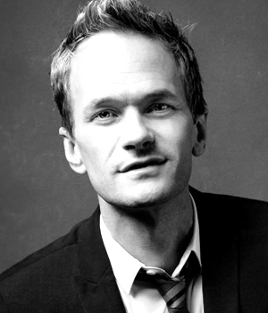
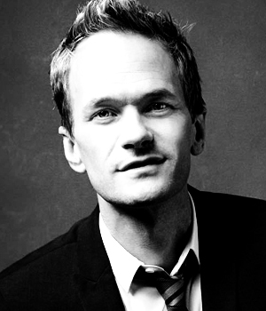
Compare these two below. On the left is the unsharpened version and on the right is the sharpened version:
 vs
vs  STEP FIVE:
 set your now sharpened and duplicated black and white layer to "soft light". You can play around with blending modes here as well for different results, but for this style in particular the soft light helps up that contrast even more and it works really well with eventual color layer.
 STEP SIX: Now is time for color!
 This will be your third layer. You can either create a new layer and fill it with the paint bucket tool or create a new color fill layer (I do the latter but both will yield the same results). You may have to play around with the color a bit but I recommend avoiding brighter shades and hang around the lesser saturated ones but at this point it is truly personal preference. Set this layer to around 80% opacity (or whatever opacity fits your vibe).
STEP SEVEN: Add text. Font choice is HARD. I used
Snow White and
Champagne & Limousines, which are both available for free download and you will have to add them to your computer's font folder before it will be available to you. For the large single letter I used Snow White in size 200 and for the word beneath it Champagne & Limousines in whatever size will fit the width of the larger letter. The longer the word, the smaller the size to help create balance. Then just play around with the placement of your letters, how high up or how low you want them to go. Generally somewhere in the middle middle is the goal but you can shift it a bit so the curves and lines of the letters hit certain parts of it or frame the subject (like the lines of the F framing his face).

