 Potterdom Mod Potterdom Mod
Book Club Mod

  Giant
Join Date: Jul 2003 Location: Ferrix: GMT-6
Posts: 56,908
Hogwarts RPG Name:
Moritz Schultz (#0f667e)
Ravenclaw Seventh Year
Hogwarts RPG Name:
Nancy Schultz (#ac6f77)
Hufflepuff Fourth Year  x11 x11  x1 x1
|  May 2015: hermionesclone May 2015: hermionesclone curly haired prefect - "sometimes I get angry!" - 30/90 - *chicken emoji* - probably @ Disney - I speak dog
 Heeeey SSers, happy May! It's been a while, but we're back with our Madame Malkin's Graphic Maker Spotlight - this month, the honor goes to none other than hermionesclone, also known as Kita! Kita sat down with Anna Banana to chat about graphics and presented an AWESOME tutorial (starring an Avenger, so you KNOW I loved it  ) for all you aspiring graphic makers out there to see how she does it! Enjoy, and don't forget to head to Colin's Corner to discuss how amazing Kita's interview wa! ) for all you aspiring graphic makers out there to see how she does it! Enjoy, and don't forget to head to Colin's Corner to discuss how amazing Kita's interview wa! Text Cut: Part 1 - Interview
Interviewer - Anna Banana
Interviewee - hermionesclone Ladies and Gentlemen! Boys and Girls! Good people of SS! I bring to you yet another exciting interview with an extremely awesome SSer! We've known her as Alec and Grayson's RPer, and she likes to hang out in a little place called The Secret Garden. She's the ONE, the ONLY...KITA!! aka hermionesclone! Kita dear? You may come out now! Say hello to our lovely SSers!
----- *ENTHUSIASTIC RUNNING OUT FROM THE SHADOWS* DID SOMEBODY SAY KI-- *trips* *straightens self up again ahem* Kita's me, I am Kita! HAI Anna and HAI lovely SSers! Thanks for the lovely introduction, by the way.
----- *tries to act composed but rushes to Kita's side anyway* We can't have our Kita getting hurt! *clears throat and continues interview* So...we have Kita here today, because she's been awarded the honor of being the Madame Malkin's Artist Spotlight for the month of April! YAY, KITA!!! Kita is one of the co-owners of the shop The Secret Garden, where very awesome graphics are made! Kita, how and when did you get started making graphics?
----- MY HERO! I'm so excited for this, can you tell? *bounces and blushes* You're sweet, Anna-face! And you're asking me that as if I actually remember the origins of my graphics making. UM, I know that it started from SS (where else?) and it was waaaaaaaay back in the 2010/2011 region when I was an itty bitty 16/17 year old who wanted to try ALL the things on SS. I remember seeing other people's gorgeous pieces of work and wondering if I could do something like that and so, I thought I'd give it a go. I wasn't very good, though, so looking through my old graphics was......... interesting, to say the least.
----- I'm SO EXCITED for this, too! WHAT WHAT? You don't remember exactly how you got started with graphics? *gasp* Just kidding!  I remember my early days, when I wanted to do EVERYTHING on SS, too. *is still that way* Well, I'm really glad you decided to try graphic-making, because you have amazing skills! AMAZING. I remember being completely in awe of those house table graphics you made for the banner competition we once had. Congratulations (again) on that, by the way! You co-own a shop on SS, which was mentioned before. What's the most rewarding part about having a graphics shop? I remember my early days, when I wanted to do EVERYTHING on SS, too. *is still that way* Well, I'm really glad you decided to try graphic-making, because you have amazing skills! AMAZING. I remember being completely in awe of those house table graphics you made for the banner competition we once had. Congratulations (again) on that, by the way! You co-own a shop on SS, which was mentioned before. What's the most rewarding part about having a graphics shop?
----- XD It sounds bad, I know. SS is just SO exciting, that's what it is. *convinced* Aw, Anna! Thank you, lovely! That means a LOT to me. *loved* Is it bad that seeing those table banners in the threads still makes me fangirl and beam in pride? *still does* *is cool yo* Thank you! I'm glad you like them! <3 Most rewarding part has to be the comments. Nothing can beat reading comments from people you've made the graphics for (or from anyone, really) saying that they like what you've made for them. Even if it's a simple thanks, it still makes my heart swell. It's definitely my favourite part! And I LOVE co-owning a shop with the amazing Talikins and we're very good friends so having that friendship through all of this makes it rewarding as well.
----- No, no! It's not a bad thing at all! I would be so proud, too, if those were my banners! You want to know a secret? When those banners...
were first shown in the competition, I IMed Roro on Skype and went on and on about how awesome your banners were, only I didn't know they were yours at the time!  And YES, reading comments from people AND seeing them wear graphics you made is very rewarding! *agrees with you there* Do you have any tips for people who want to start making graphics or who already do? *is SO wanting to learn from you* And YES, reading comments from people AND seeing them wear graphics you made is very rewarding! *agrees with you there* Do you have any tips for people who want to start making graphics or who already do? *is SO wanting to learn from you*
----- *FANGIRLS* Anna, you're SO ADORABLE! Gosh, that made my heart melt and I'm going to end up crying happy tears <33 Tips? Gosh, that's a hard *FANGIRLS* Anna, you're SO ADORABLE! Gosh, that made my heart melt and I'm going to end up crying happy tears <33 Tips? That's a hard one! I think my tip would be to not be afraid to try something new, whether you're a beginner or a super duper whizz at graphics making. You never know: this new thing could just end up working out well for you. I always try and think about image placement/what images will work well together (if I want to select more than one) before I start the actual process of making the graphic. And believe that you CAN do it and keep at it until you get it. You'll get there, I believe in you <3
----- I'm the adorable one?! No, YOU are! You are our SPOTLIGHT, after all!  It's true, though. I was so amazed at your banners. I remember thinking that I wished I could design graphics like that. I can do graphics, but I'm rubbish at designs, I think. So, TIPS! I'm so excited to learn something from you! It's such good advice, too, and you are such a sweetheart for giving us such motivation! *throws confetti all over you* You're right, because I just had to practice and practice to get graphics I was somewhat happy with, and I do believe I got better over time! That's good inspiration for anyone wanting to try their hand at graphic-making! Thank you, Kitakins! What's a graphics-making feature that's hard for you? I know blending is really tough for me. It's true, though. I was so amazed at your banners. I remember thinking that I wished I could design graphics like that. I can do graphics, but I'm rubbish at designs, I think. So, TIPS! I'm so excited to learn something from you! It's such good advice, too, and you are such a sweetheart for giving us such motivation! *throws confetti all over you* You're right, because I just had to practice and practice to get graphics I was somewhat happy with, and I do believe I got better over time! That's good inspiration for anyone wanting to try their hand at graphic-making! Thank you, Kitakins! What's a graphics-making feature that's hard for you? I know blending is really tough for me. 
----- You're going to make me blush! I think, what happened with those banners was just experimentation? It was just a bunch of textures and shapes, each with their own modes applied to them. Aww! Thank you, lovely! *!!!!!!!* *twirls around in the confetti* Yes exactly! You get better over time 'cause you're always learning something new? So yeah, don't give up. No problemo! :3 A graphics making feature that's hard? Gosh, am I allowed to say everything? *joking, maybe* I'd say working with pictures that aren't of good quality? Or, I usually use a certain number of adjustments in a certain order and if the picture doesn't come out looking good, I'm usually at a loss for what to do. And yeah, blending is REALLY hard! I don't know how Roro does it. Trying to crop out pictures of models who have their hair flying out behind them is something I struggle with as well. I try to avoid it as much as possible.
----- Ahh, I love when graphics brilliance just happens by accident! That doesn't happen to me often, but when it does, I just love it! *reads the part about what's difficult for you when it comes to graphics* I agree about high quality pictures, and it's something you really don't understand unless you're a graphics maker yourself! Also, YES! Models with curly and wavy hair are very difficult to work with. At least for me! So, Kita, as you know, with each Artist Spotlight, we ask the artist to give us a tutorial. Tell us a little about the tutorial you have for us! *is so excited to learn from you*
----- Same! It makes me feel so smart, for some reason XD Exactly! They're impossible to work with. OH OH! The tutorial, yes! Funnily enough, the tutorial is linked with what we were just talking about in regards to the quality of pictures. It's a little tip my graphics design teacher told me about and, after doing a bit of research and tweaking, I came up with my own tutorial for making the quality of pictures look just that little bit better. I've tried to use it for some of my recent graphics as well, especially in the case of banners where I've REALLY wanted to use a picture in particular but, after adding in the adjustments, nothing looked right. So, hopefully this tutorial should help with that. 
----- Well, there you have it, ladies and gentlemen--the amazingly talented and sweet KITA! Okay, Kita--any parting words? If so, here's your chance to tell us and then to make your GRAND EXIT! Thank you so much for this interview and tutorial and congratulations again on being the Artist Spotlight for May!
----- Anna, you're so sweet! *all beamy and emotional and trying and failing to act cool* Parting words? Is this the part where I try and fail to sound wise? *thinks that's likely to happen* Just thank you to everyone who's given me a chance or given me warm complimentary words or words of encouragement and to those who've helped me along the way. I really appreciate it. And good luck to anyone trying their hand at graphics making. And with that, I go! Thank you for interviewing me, Anna! This was fun. *squishes before poofing in a puff of glitter and smoke* Text Cut: Part 2 - Tutorial
HAI! I'm going to be showing you a tutorial on how to make screenshots look better and make it look like it's a bit better in quality. It won't make it a completely high quality image but it should tweak the image in a way to make it look good. I started off with this screenshot of Scarlett Johansson in Iron Man 2 and ended up with this at the end. I created this using Photoshop CC and because of the use of Selective Colouring, it can't work on other programs. Sorry!
1) First things first: open the picture up on Photoshop and duplicate the base layer. Easy peasy!
2) Next, go to Filter > Blur > Surface Blur. This should hopefully make the picture smoother and get rid of any weird pixelated parts. The Radius and Threshold varies from image to image so have a fiddle around with it until you reach a point where youre happy with the overall result. Honestly, I tend to fiddle around with my graphics a LOT and it takes a bit of time and patience but youll get there!
For this particular image, I changed the Radius to 5 pixels and the Threshold to 6 levels. I then changed the Opacity of the layer to 50%. 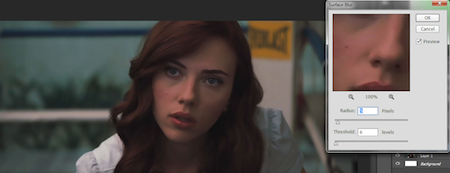
3) Once thats gone, duplicate that layer (the one you just added the Surface Blur to). Go to Filter > Other > High Pass. On the window that pops up, adjust the Radius to one where youre happy with the outcome. Mine was: 31.9 pixels. Then, lower the opacity to something around the 50-60% mark and change the Mode to Soft Light. This is what my image looked like after that step. 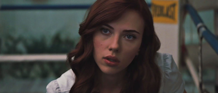
The quality looks quite a bit better there but we still need to add in some adjustments to it because we like adjustments, yes? These set of colourings are particularly good for dark screencaps but if you have any other adjustments you like to use, feel free to go with that. 
4) Firstly, select the first three layers (original layer, surface blur layer and high pass layer) and duplicate them and THEN merge those three duplicated layers.
5) Duplicate that base layer and set the Mode to Screen.
6) Insert a Levels layer! The settings I used were: 0, 1.00, 209. 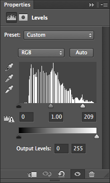 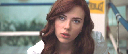
7) The image was starting to look a little TOO bright but no worries! I went ahead to insert a Colour Balance layer. You can use whatever settings work for your image, since different images will need different adjustments, but the ones I used are in the screenshots below. 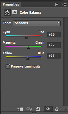 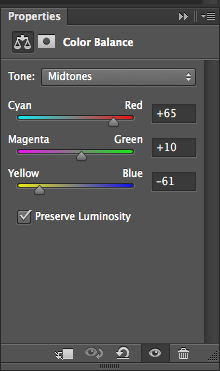 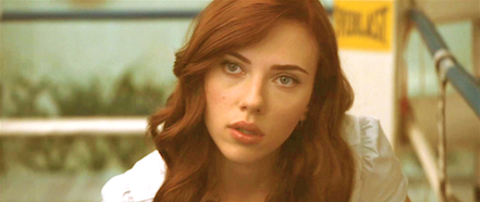
8) The image is starting to look VERY bright and yellow but that'll be good for the next couple of steps.  Duplicate and merge the following layers: base layer (this is the NEW base layer, the one made in step 4), Screen layer, Levels layer and Colour Balance layer.
9) Go to Image > Adjustment > Desaturate. This will make your image black and white. To make it look better and to make it blend into the layers beneath it, change the mode to Soft Light. The image should look something like this: 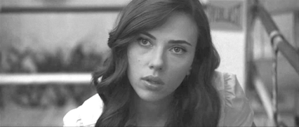
And the layers menu should look something like this: 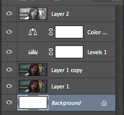
10) Add a vibrancy layer. This is exactly as the name suggests: itll make the picture look more vibrant and is very similar to adding in a curves and levels layer but the effect comes out quite a bit different. I added a Vibrancy of +100 which should work for most images but its totally down to personal preference :3 This step works especially well for the darker images. 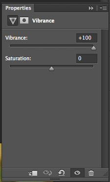 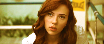
11) Next, Selective Colour! This adjustment can either be your best friend or your worst enemy but if you get it right, the image will look stunning! This is the one that adds a major contrast to the image as a whole, in my personal opinion. Different images will require a different setting but this one is based on my love for making colours pop in my graphics. Have a fiddle around and see which values work for you? The settings I applied to this image are shown in the screenshots! 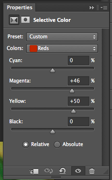 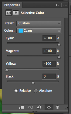 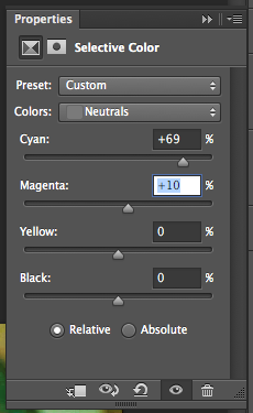 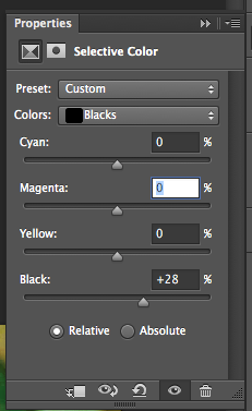
12) After all of that, my image ended up looking something like this, which is MUCH better than what it looked like before. 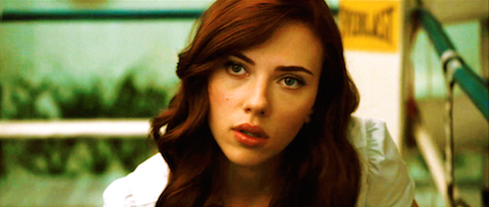
13) Then I simply added in a gradient layer of black to white and set the setting to Soft Light, which is a trick I picked up from Dees (Gryffindoll) tutorial up there. It just makes it look better in my opinion so thank you for this tip, Dee! <3 The screenshot below shows the list of layers I had after applying the Gradient Fill layer. 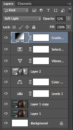
14) Heres the final result! Its probably not as great as some of the more high quality pictures that I like to use but it looks much better than it did before. :3 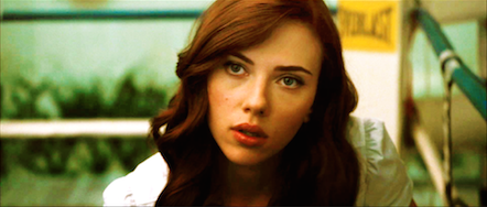
Hope this tutorial helped and isn't too complicated! If you have any questions, don't hesitate in contacting me about them <3
__________________ I'm still standin'________________________________________ better than I ever did

Lookin' like a true survivor_________________________________feelin' like a little kid |