
10-20-2011, 01:26 PM
|
| |
 Pottermore Insider blog explains creation of Hogwarts House crest designs for site Pottermore Insider blog explains creation of Hogwarts House crest designs for site
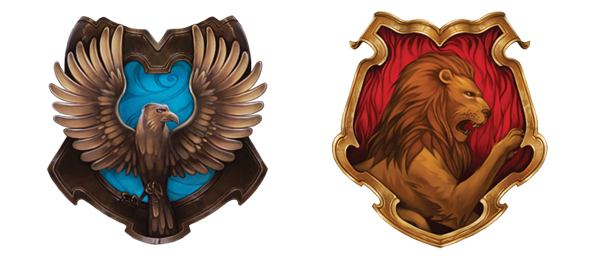
The Pottermore Insider blog gave a bit of insight into how they created the four Hogwarts House emblems for Gryffindor, Slytherin, Hufflepuff, and Ravencalw for J.K. Rowling's interactive Harry Potter website, which look quite different than the crests seen in the films. More on that, including early sketches, can be seen and read below. The final design for the Ravenclaw house crest shows blue air currents around the bronzed eagle, while the Gryffindor house crest focuses on the golden lion’s powerful face, its raised paw, and the scarlet flames flickering behind.
 Many of you have told us how much you like the Pottermore artwork, so we thought you might enjoy a behind-the-scenes look at how it was created. We spoke to the Atomhawk Design team, who were responsible for creating the Pottermore illustrations, and in this post (the first of two) we’re going to look at how they went about creating the Ravenclaw and Gryffindor crests.
In the beginning
The starting point for each of the house crests was the Hogwarts crest, which first appeared on the title pages of the Harry Potter books, and represents all four Hogwarts houses. This original artwork and J.K. Rowling’s descriptions of the houses were used to inspire four unique house emblems for Pottermore.
The process
The artists started by talking about the best way to include the natural elements of fire, earth, water and air into each house; what the best positions and expressions for the animals would be; and the most effective way to include the house colours in the final designs.
Their main aim all the way through the process was to make the crests into symbols that Sorted Pottermore users would be proud to display as a token of their Pottermore identity.
To start with, three versions were sketched for each house crest. The team then looked at each variation to make absolutely sure the details and attributes of each house were clearly represented. The design they felt was the strongest out of the three was selected to go through to the next stage of the process, which involved adding colour to the designs.
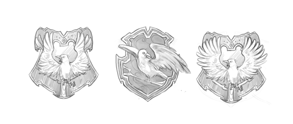 Ravenclaw sketch series
For Ravenclaw, the artists tried to stay true to the form of an eagle but they found it didn’t work at times; the centre sketch, for example, was thought to look too much like a gull. As the eagle has been used in mythology throughout history, the artists were also aware that it could be difficult to make their eagle instantly recognisable and original.
After the sketches were finished, everyone agreed that the pose with wings outstretched was the best. They felt that the image of the bird going outside the borders of the crest showed Ravenclaw at its strongest: an eagle unbound by the borders of the shield and ready to take flight.
Ravenclaw colour process
Interestingly, Ravenclaw was the only house for which the team did not create a number of colour options. The first colour design became the final version of the crest as they immediately felt that they had it right. They added blue to the swirling air element in the background, then coloured the eagle bronze. Once they placed it within the polished silver framework of the crest they felt they had got the spirit of Ravenclaw in one go!
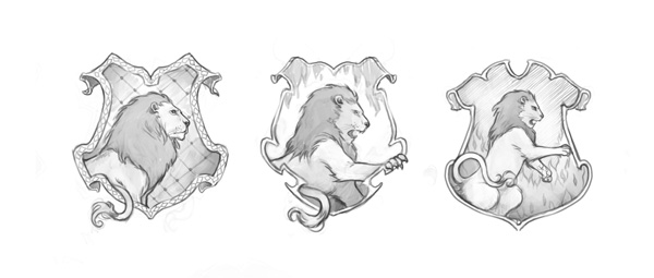 Gryffindor sketch series
As the lion is another symbol often found in popular culture, the team again needed to focus on creating a recognisable one for the Gryffindor house crest. For all four of the crests the facial expressions of the animals were used to symbolise house traits (in this case courage and chivalry). As you can see in the sketches above, the artists were trying to capture the expression of a lion waiting to attack, as well as one that was mid-roar.
After the initial sketches were examined it was decided that the head of the lion, with its strong face and striking mane, was the best design as the crest showing the body seemed to take away from the lion’s powerful features.
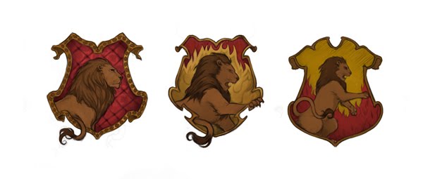 Gryffindor colour process
The crests for the first Gryffindor colour designs were treated with a gold and scarlet colour palette. Then the background designs were looked at closely, so that the fire element could be shown in the most striking way. The art team agreed that the best version was the one that used the full red background but they felt it still needed the strength of the fire displayed in the other designs.
The twitching tail that escapes the boundaries of the crest in the first two images was judged to be too much of a distraction from the power of the lion’s attacking stance and the fearsome expression on its face, so it was removed from the final version.
 |